Regardless of the specific goal of a campaign, your marketing efforts eventually lead towards the goal of conversions. So what connects the ad and the conversion? The landing page.
But what turns a landing page from, well, just a page to land on, to an effective path to conversions? Let’s take a look.
First thing’s first: landing pages and your conversion paths
Landing pages are an extremely common method for capturing leads. They’re useful not only to get in contact with potential leads, but also for building remarketing lists. The landing page and its contents are a significant component of your conversion path.

For roofing company State Roofing, here is an example of their Landing Page.
But about the whole “getting in contact” part of landing pages — you’ll often see landing pages include form fills that allow users to, naturally, fill out contact information to learn more about your products and offers. That’s where the title of this post comes into play: overly-complicated, poorly-executed form fills are a huge mistake that are unfortunately quite common.
Two major culprits? Form fills that are too long or in a less-than-optimal location on the landing page.
Both of these can be unified into one root problem digital marketers are familiar with: humans have super short attention spans. Because of how fast modern technology is, this is more true now than at any point in human history. This short attention span means it’s easy for a lot of people to get side-tracked. And, typically, that means abandoning your landing page.
Due to this, form fills that either take too much to fill out or are out of sight on the initially visible part of the landing page have an uphill battle; conversion path placements can make or break your performance, so putting your form fills at a disadvantage puts you at a disadvantage.
How to make sure your form fills crush it
As you’d probably intuitively assume based on your own experience on the other end of them, there are studies that have found direct correlations between the amount of a form fill’s requested fields and conversion rates. There are of course exceptions, but we highly suggest limiting the amount of information you request in a form fill. In general, an effective one will request the bare minimum necessary to reach those leads.
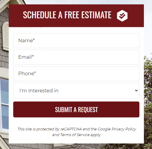
For State Roofing, here is an example of their Lead Form.
Typically, requesting name, email, and phone number should get the job done. The more information you request, the less likely any given user is to finish filling it out. And each time someone arrives at your landing page without finishing your form fill, you’ve just spent money on someone who didn’t even provide a lead.
The implication, then, is that a form with fewer fields should increase your conversion efficiency and through extension lower your cost-per-lead.
(Plus, from a legal standpoint, less client information is better considering how anything online carries the risk of digital security breach.)
So, other than making sure your form fills aren’t gigantic, what else can you do to ensure they’re successful?
Crucially, you can pay attention to the fold. This is the area of the landing page that’s immediately visible on a computer or mobile screen after loading. Everything not visible — i.e. what a user would have to scroll down to see — is considered “below the fold.”
As you can probably predict because of human’s aforementioned miniscule attention spans, we really recommend displaying your form above your landing page’s fold. Even better if it’s next to an eye-catching, brief explanation of why the searcher should be interested in your services.

For State Roofing’s About page, the Lead Form is “above the fold.”
Lastly for your landing page, don’t neglect your buttons and CTA’s!
Button formatting is super important — particularly for your CTA or “call to action.” The CTA is the clickable button on an ad, form, etc., that both instructs and entices the user to take the next step. For example, ads can include CTAs like “Shop now,” “See our products,” “Get a quote,” “See our offers,” or really endless other things depending on context at the button level.

For State Roofing, here are examples of two CTAs.
Another thing to consider is the CTA at the top of the form, it should stand out among the rest of your landing page’s content, but shouldn’t be unprofessionally flashy or tacky. you really can’t go wrong with keeping the CTA copy simple. Something like “Schedule a free consultation” — or the version of that that’s relevant to your form — is always dependable.
Or for click-to-call CTAs, just including the phone number is a tried and true method.
Just like with so much of digital marketing, a lot of creating a top notch landing page is about keeping it simple. A landing page that tries to do too much will end up doing very little. So identify: what’s the goal of your landing page? And then let the answer guide you. And to support that goal, keep that form fill short and sweet and immediately in sight.
If you follow those principles, you’re already putting yourself in a position to have a high floor for success. And that’s what this is all about!