As part of a digital marketing team, you have a big job. Writing, analyzing, and using technology are all part of your core responsibilities. But what about when your executive team needs updates on the performance of your current campaigns and initiatives? When that happens, your role pivots to being about communication and data visualization. With that in mind, here’s how to nail reports that are headed to upper management and/or your board:
Questions to Address
The first step to giving a clear, conclusive marketing report is identifying the questions you’re trying to answer for your executive team. A wise person once taught us that clear thinking begets clear writing; as offshoots of that, the same is true of presenting, reporting, and analyzing— and the foundation of that clear thought is knowing exactly what the goals of your reporting are.
While most of your reports will revolve around many of the same questions, you may want to emphasize certain ones over others depending on the circumstances. There are some questions that are integral to marketing operations so, naturally, you’ll find yourself frequently returning to these:
How much money was spent on this campaign?
How many people were reached?
How effective was the marketing?
What was the financial return on the marketing expenditure?
Of course, that’s hardly a comprehensive list of possible questions, but they’re all ones that will be the pillars of many reports.
While it is important to clearly identify the questions to answer in a report, it isn’t as useful if you don’t know how to, you know, actually answer those questions. Just like you can’t deliver an insightful report without knowing what concerns to address, you can’t create a helpful report without knowing how to use the data to drive further progress.
For example, if the main goal of your report is addressing the question, “How much money was spent?” then the concrete metric you’re searching for is the cost. If you’re asking, “How many people were reached in this campaign?” then the corresponding metrics you’re looking for would be answered via the quantitative value of impressions or users. Common metrics you could use include:
When discussing PPC: Cost, impressions, clicks, conversions, cost per conversion, and so on.
When discussing SEO: Users, new users, sessions, session duration, and more.
Now, you may have just read this and said, “Yeah, duh”, which is completely reasonable. We started at these basics because, no matter how many marketing reports you’ve dished out, these components are the foundation to a successful one — whether you’re creating your first report or are a decades-long veteran of them.
Picking a Format
Again, knowing which formats to choose — both for displaying data and for the report— might seem basic. If you’re thinking that, you’re
right! But, just like knowing which questions you’re answering, and the metrics
used to measure them, understanding the suitability of different formats is
integral to your reports’ readability and success.
There are two different aspects here: the format for data visualization and the format for the overall report. Both formats include options that are better suited for different scenarios.
For the report itself, the two most prominent formats are either through PowerPoint or Excel, or a combination of the two. If you want to go to the next level of new reporting gadgets, we recommend Google Data Studio, which you can read more about here. PowerPoint is of course the standard for presentation tools. There is a reason for this — it’s clear, straightforward, and gets the job done. Excel, on the other hand, can be utilized with tremendous effect for those looking to communicate and compute raw data. A savvy Excel user can absolutely kill it when presenting metrics that matter.
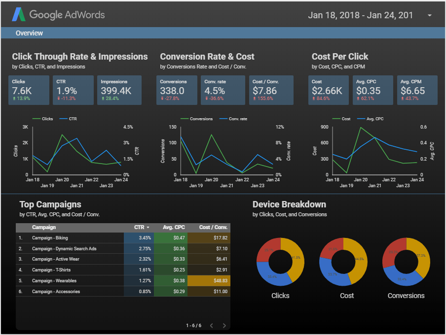
Example of a report in Data Studio
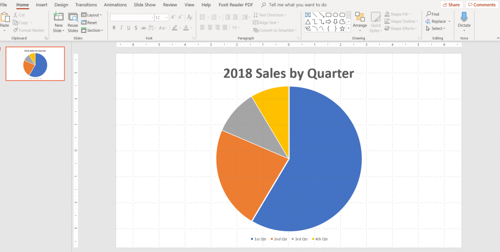
Example of a report in PowerPoint
Example of a report in Excel
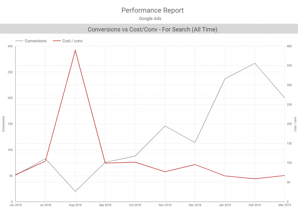
So that’s the report format, but what about the contents inside? There are plenty of options to choose from, each with different purposes. Line and bar charts, for example, are well-designed for comparing one or multiple metrics over a period of time, like showing conversions by month. If you were using those to talk about multiple metrics, you could compare conversions vs cost per conversion over that same time period. Essentially, the axis system of those formats makes them ideal for analyzing the relationship between two variables, where the constant variable will often be time.
Example of line chart
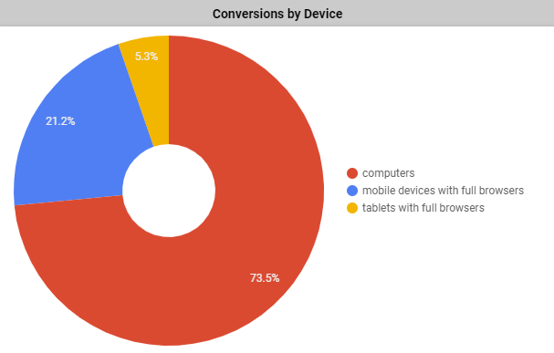
Another common format you might find yourself using to present data is the pie chart. While graphs are great for breaking down data based on two variables, pie charts are great for breaking down a whole based on its components. For example, one way we use pie charts in our reports is showing conversions by device that were driven during a time period. This helps us speak to conversions overall, as well as which specific devices drove the most success.
Example of pie chart
The wrong report format can be overwhelming and jumbled, convoluting the very answers to the questions you’re addressing and cluttering everyone’s ability to decipher conclusions and trends. The right report format should be engaging and clear, turning raw metrics into a concrete, digestible conclusion.
Telling the Story
Conveying the overall trajectory and story in a report will largely come easily — if you were mindful of the previously-discussed aspects of your report. It’s pretty intuitive: if you’ve already clearly established questions to be answered, how you’re measuring the answers to said questions, and are presenting these things in an appropriate format, the story will mostly tell itself.
Of course, there’s still other details to consider to make sure the bottom line is communicated as effectively as possible.
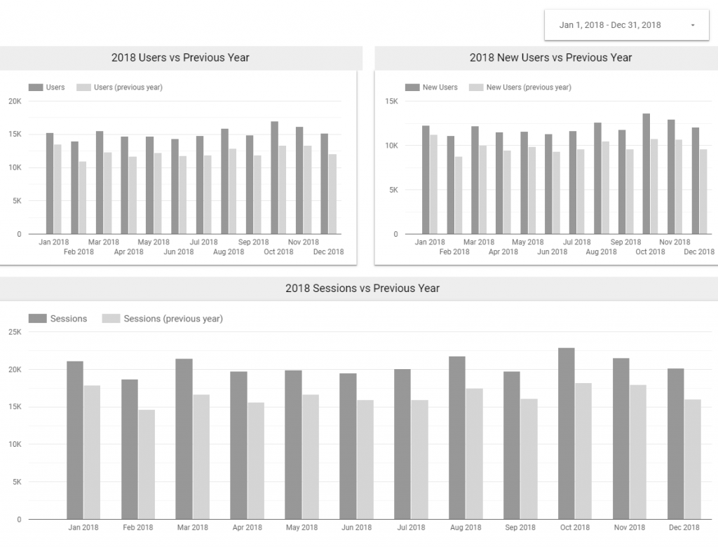
One of those details is the time frame from which to draw data. Common time frames include the past month or quarter, but longer time periods such as six months to one year are also frequently used. When discussing the data within that time, it’s always possible, when relevant, for this data to be compared to its corresponding points over a different period of time, such as comparing December 2019 to the same month one year prior (December 2018) or comparing Q1 2019 performance to Q1 2018 performance.
Example of Year Over Year Comparison
While the story will come easily if you did your due diligence, it still won’t be complete. Even if you choose the right metrics and format for your report, you still need to explain the context, or the story, to your executive team Once the materials are prepared, providing them with that context to tell the story is the icing on the cake. For example, if you work at a museum and you’ve seen a sizable increase in traffic over last quarter, make a point to speak to the traffic increase driven by adding those two new exhibits that also got picked up by local news outlets thanks to your PR team’s efforts.
So, what information helps frame your report? For starters, the marketing goals your team set out to accomplish at the beginning of the time frame. This could be your company’s goal to decrease your PPC costs per conversion by 20% or the SEO team’s goal to increase organic search sessions by 20%. Intuitively, if discussing what your goals were, you’ll also report on whether or not you met those goals. Ultimately, having this data lead back to leads, sales and company growth is key.
Other quantitative pieces to the puzzle
include the performance of a metric at the beginning of the time frame versus
at the end of the time frame, which will mostly be apparent if you’ve picked
the right medium through which to express the data. For all this talk about
quantitative details, however, there are plenty of qualitative aspects that are
valuable to the story too. These include tasks and projects that your team
completed during the time frame and/or upcoming projects, tasks, or
recommendations on what to focus on next.
Ready to Get Started With Your Report?
The keys to an effective digital marketing
report come down to basics. If the components of a successful report was
distilled into two principles, we’d argue it’s this:
“Keep your thinking clear,” and “Assume the executive team aren’t subject matter experts.”
With those fundamentals guiding your way
through the different aspects of your report, you’ll have clear, effective
communication. That way, you can spend less time reporting, and more time on
improving the performance of your campaigns.
Sign up for our newsletter and get our free Digital Marketing Handbook
Stay in the know with the latest industry news and insights from our digital marketing experts. As a bonus, our comprehensive eBook will help you fulfill your company's vision of success!
Sign up for our newsletter and get our free Digital Marketing Handbook
Stay in the know with the latest industry news and insights from our digital marketing experts. As a bonus, our comprehensive eBook will help you fulfill your company's vision of success!
Sign up for our newsletter and get our free Digital Marketing Handbook
Stay in the know with the latest industry news and insights from our digital marketing experts. As a bonus, our comprehensive eBook will help you fulfill your company's vision of success!
Sign up for our newsletter and get our free Digital Marketing Handbook
Stay in the know with the latest industry news and insights from our digital marketing experts. As a bonus, our comprehensive eBook will help you fulfill your company's vision of success!