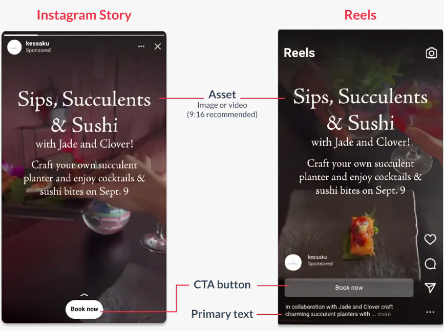
For many, when we think about digital advertising, we think about static ads. As the name implies, these are advertisements with still assets — copy, visuals, etc. They make up a huge swatch of the online advertising ecosystem.
And yet, many platforms are pushing video content hard. The movement (and often audio stimuli) of these media naturally pique users’ interest simply on this basis. As these videos and moving advertisements get more important, it means your static ads are constantly having to compete with them — a medium that’s more inherently attention-grabbing.
So, how do you approach static ads and make them stand out in an environment where that’s more difficult than ever?
Start out with a clear strategy
It’s important here to recognize that creating an effective strategy isn’t a one-time thing. Rather, this is an ongoing iterative process that will frequently change based on what you learn and how users’ behaviors and preferences evolve over time. Accordingly, a successful static ad-based campaign from, say, 2018 would look different than one two years from now.
While the specifics of your ads and campaigns’ appearances will be constantly evolving, one thing that should not change is your guidelines for creating them.
For example, a crucial part of this is making sure all creative elements are aligned. This means your visuals and text assets should complement each other — and don’t just take for granted or assume. Be deliberate and consider how and why assets work.
Really, your job is 1) to resonate with the audience through a strategy that’s 2) based on both creating (and thoughtfully implementing) new ideas while refining old ones in response to feedback, performance, and the takeaways you can infer from those.
Here’s some principles that will help you do that:
Creative best practices for your static ads
Let’s start with the visuals.
It’s worth keeping in mind that, although static ads won’t always be shown directly alongside videos or video ads, they A) often will be and B) are still being viewed by people who are more and more used to videos as a baseline for what engages them. In that way, your static ads are still always “competing” with videos.
This means you need to be especially mindful of how your ad will visually engage users, considering its static medium puts it at a disadvantage for initially grabbing attention. Ask yourself, for starters:
- What visual elements are attention-grabbing? What kind of clever imagery could I use? What about bold colors that draw the eye?
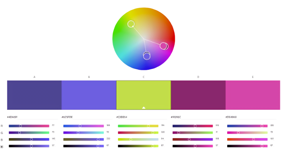
- Speaking of, am I utilizing contrasting colors where possible (without straying from brand consistency) to draw focus?
- How am I using negative space, if applicable?
In the case of negative space, it allows you to guide viewers to certain parts of the ad to help make them navigate it the way you intend. It also helps group information together appropriately while preventing clutter.
We also alluded above to your brand consistency. For obvious reasons, you don’t want ambiguity about who people attribute your advertising to (you!).
This means your font, colors, and other relevant details should be easy to read and aligned accordingly with your brand and what you want to convey — that goes across all platforms. (Don’t choose Comic Sans if you’re a law firm, for example. Although on second thought, don’t choose Comic Sans ever, obviously.)
If you have a signature font or palette, for example, make sure your advertising works with that — particularly when you consider the long-term impacts of this. Even if you don’t have these, we still cannot emphasize enough the importance of being deliberate with your images, color and font use, and branding in general. (This includes how you utilize your logo and where you place it, by the way, when appropriate to include.)
Aside from the visual components of your static ad best practices, there are some others we’d be remiss not to mention here.
This includes having a clear call to action, for starters. (Sure, technically visual, but you get it.)
You want users to have a clear “next step” while also driving them to take said next step. Ambiguity or an uncompelling prompt are your enemies here.
And of course, make sure your ads — just like everything — are optimized for mobile, too. The fact is that most people interact with most sites mostly via mobile; optimizing your ads only for computers is cutting out a huge portion of potential users.
Then, lastly, as we always harp on here at Fujisan: Test!
Test different creative assets to make sure your static ads aren’t leaving anything on the table. Different copy, branding, imagery, and other assets will resonate differently — your goal is to find the combinations that resonate the most with your target audience.
Which brings us to:
A/B testing with static ad content
We’ll start here with potential differences you can test. Some common useful ones include:
- Images
- Color schemes
- Copy
- Alignment of creative assets
It’s worth noting that you can also test the medium itself, which could include a static ad vs the same assets held as constant as possible in a video format. Two big things we advise people to keep in mind are the time period you’re testing over, and the magnitude of difference in your creative assets. Essentially, the length of time needs to be such that you can gather statistically significant data.
Regarding the timeline of a test, we have to stress that you shouldn’t run one if you don’t have enough of a budget to go longer, or if your timeline is too short due to other factors. With either of these, you’ll end up spending money on a test that isn’t likely able to give you significant insights.
And to elaborate on the creative assets needing to be significantly different, it’s generally not enough, for example, to just change the color of one asset and call it good. While there can occasionally be exceptions, in general, we always emphasize the importance of holding everything else constant and making sure your creative changes are significant enough that you can reasonably attribute user behavior accordingly.
If we can stress one thing about static ads, it’s the importance of them being visually engaging. The climate for digital advertising is pretty different than it was just five years ago — you’re vying for the attention of people who are accustomed to visual stimuli in a medium that’s naturally more engaging, aka video.
Overall, grabbing the attention of users is harder than ever, so it’s crucial to keep that in mind every step of the way.


